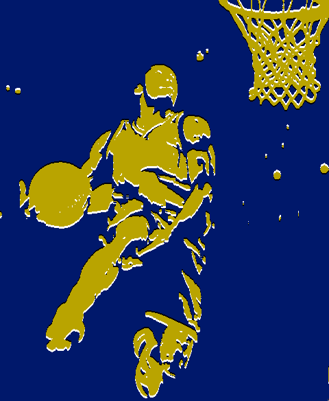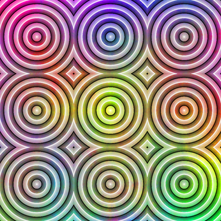
I wonder if illustrators ever use this trick to spice up their images. Anyone know of any examples? Key features would be:
- Light but not white background, dark but not black object, or vice versa. Possibly colored.
- Object outlined in back and white, black and white on opposite sides of object. Possibly these outlines would look like lighting and shadow effects.
