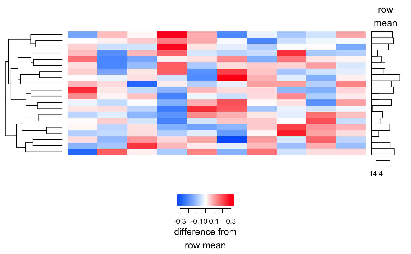
Produces a heatmap as a grid grob.
plot_heatmap(y, cluster_samples = FALSE, cluster_features = TRUE,
  sample_labels = NULL, feature_labels = NULL, baseline = NULL,
  baseline_label = "row\nmean", scale_label = "difference from\nrow mean",
  n = Inf)
Arguments
| y | A matrix of expression levels, such as a transformed counts matrix as produced by |
|---|---|
| cluster_samples | Should samples (columns) be clustered? |
| cluster_features | Should features (rows) be clustered? |
| sample_labels | Names for each sample. If not given and y has column names, these will be used instead. |
| feature_labels | Names for each feature. If not given and y has row names, these will be used instead. |
| baseline | Baseline level for each row, to be subtracted when drawing the heatmap colors. If omitted, the row mean will be used. |
| baseline_label | Text description of what the baseline is. |
| scale_label | Text description of what the heatmap colors represent (after baseline is subtracted). |
| n | Show only this many rows. Rows are selected in order of greatest span of expression level. |
Value
A grid grob. print()-ing this value will cause it to be displayed.
Additionally $info$row_order will contain row ordering and $info$col_order will contain column ordering.
Details
This heatmap differs from other heatmaps in R in the method of clustering used:
1. The distances used are cosine distances (i.e. the magnitude of log fold changes is not important, only the pattern).
2. hclust() is used to produce a clustering, as normal.
3. Branches in the hierarchical clustering are flipped to minimize sharp changes between neighbours, using the seriation package's OLO (Optimal Leaf Ordering) method.
Examples
# Generate some random data. counts <- matrix(rnbinom(1000, size=1/0.01, mu=100), ncol=10) y <- varistran::vst(counts, cpm=TRUE)#> Dispersion estimated as 0.003407557